Using Visualization Tooltips on the CSUMB Experience Study Reports

From CSUMB Data Glossary
Jump to navigation Jump to search

What are tooltips?

Tooltips are popup boxes that appear when you hover with your mouse over a data visualization on a dashboard.

Hover over data visualizations for tooltips

Hover with your mouse pointer over any of the data visualizations on the dashboard (e.g. bar graphs) to open a tooltip with additional detail.

Screenshot showing example tooltip that appears when hovering with mouse pointer over data visualization element on dashboard
Data visualization elements on a dashboard that can be hovered over with mouse pointer to open tooltip.
Screenshot showing example dashboard and locations of data visualization elements you can hover over with the mouse pointer to open a tooltip with additional detail.
Example of tooltip that appears when hovering with mouse pointer over a data visualization element on a dashboard.

Get comparison data in tooltips for filtered results compared with overall (unfiltered) results

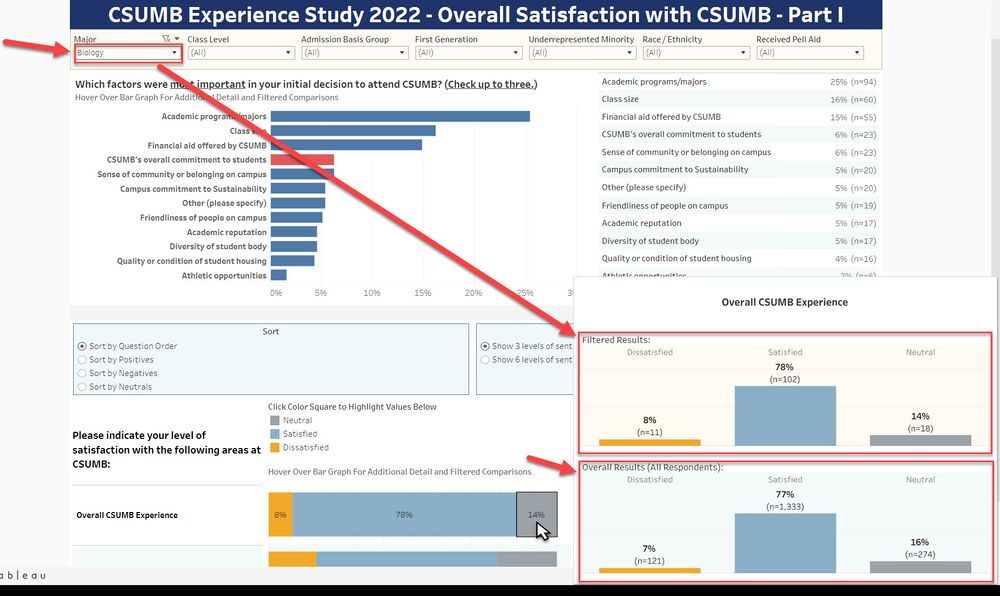
When you have applied filters to the dashboard, the Filtered Results section of the tooltip will provide you with the filtered data set results that you can compare with the Overall Results (unfiltered results) directly below.

This allows users to see how the results for a subset selection of the respondents compare with the overall respondent results.

Screenshot showing how visualization tooltips provide comparison of Filtered Results with Overall Results when a filter or filters have been applied to the dashboard
Example of visualization tooltips providing comparison of Filtered Results with Overall Results when a filter (Major = Biology) has been applied to the dashboard